
Navigation Menus: An Essential Tool for User-Friendly Websites


The navigation menu is an indispensable part of any website. It serves as a guide that leads users through the various pages and content of a website. A well-designed navigation menu not only improves usability but also contributes to a positive user experience. In this blog post, we’ll take a closer look at the importance of navigation menus and share some best practices for designing them effectively.
Keep it simple and organized
One of the most important principles in designing a navigation menu is simplicity. Limit the number of menu items to the essentials and ensure a clear hierarchy. Users should be able to see at a glance which options are available and where they can navigate to. Avoid menus that are too long, as they can be overwhelming for users.
Place the menu in a prominent location
The navigation menu should be easy for users to find. Place it in a prominent location, preferably at the top of the page or on the side. Users are accustomed to looking for the menu in these locations and can quickly find their way to the content they want. Make sure the menu remains consistent across all pages of the website.
Use clear and easy-to-understand labels
Menu item labels should be clear and easy for users to understand. Avoid jargon or overly technical terms that might be confusing. Use simple, concise words that accurately describe the page’s content or function. If necessary, add subcategories to support a more complex navigation structure.
Use dropdown menus
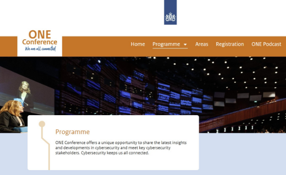
Dropdown menus can be useful for offering users additional options without cluttering the main menu. However, use them sparingly and make sure the dropdowns work intuitively. Place the most important and relevant items in the main menu and use the dropdowns for subcategories or additional options.
Responsive design for mobile devices
With the increasing use of mobile devices, it’s essential to optimize the navigation menu for a seamless mobile experience. Use a responsive design, where the menu adapts to different screen sizes. Consider a mobile-friendly menu, such as a hamburger menu, where the menu collapses and expands when users tap it.
Conclusion
Navigation menus are a crucial part of a user-friendly website. By using a simple and well-organized design, placing the menu in a prominent location, using clear labels, strategically implementing dropdown menus, and ensuring a responsive design, you can improve the user experience and easily guide visitors through your website. A well-designed navigation menu ensures intuitive and seamless navigation, encouraging users to stay on your website longer and find the content they’re looking for. Always remember to test the menu regularly and optimize it based on user feedback and behavioral analysis to achieve the best results. Want to know what TMC Media can do for you? Check out our success stories from companies that have gone before you, or contact us using the button below.
Relevant blogs


































!.png)























Interested in digital growth for your industry?
Strengthen your online presence and expand your market reach with TMC Media. We combine strategic thinking with innovative creativity to deliver measurable results. From conversion-focused websites to targeted online marketing campaigns—we’re your digital growth partner.
Contact us for a no-obligation consultation
